Senior Designer · Brand Evolution · Email Campaigns · Seasonal Campaigns
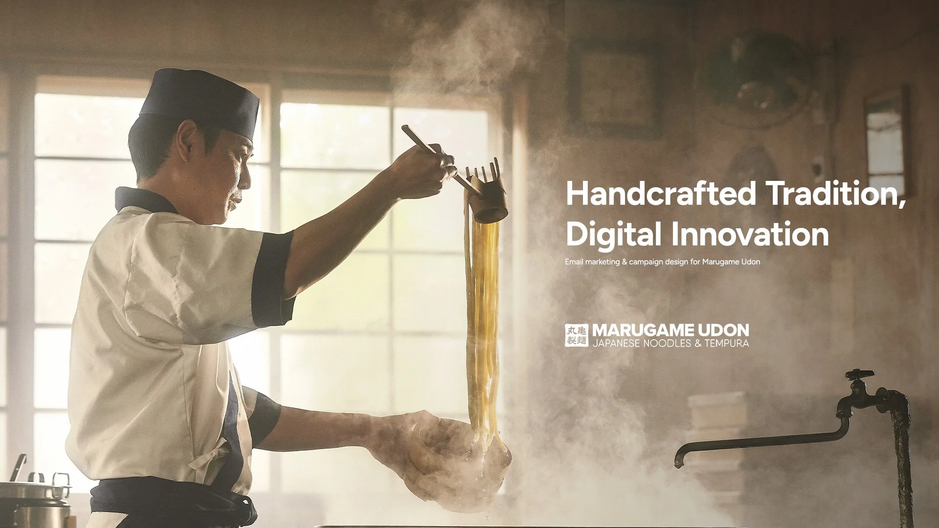
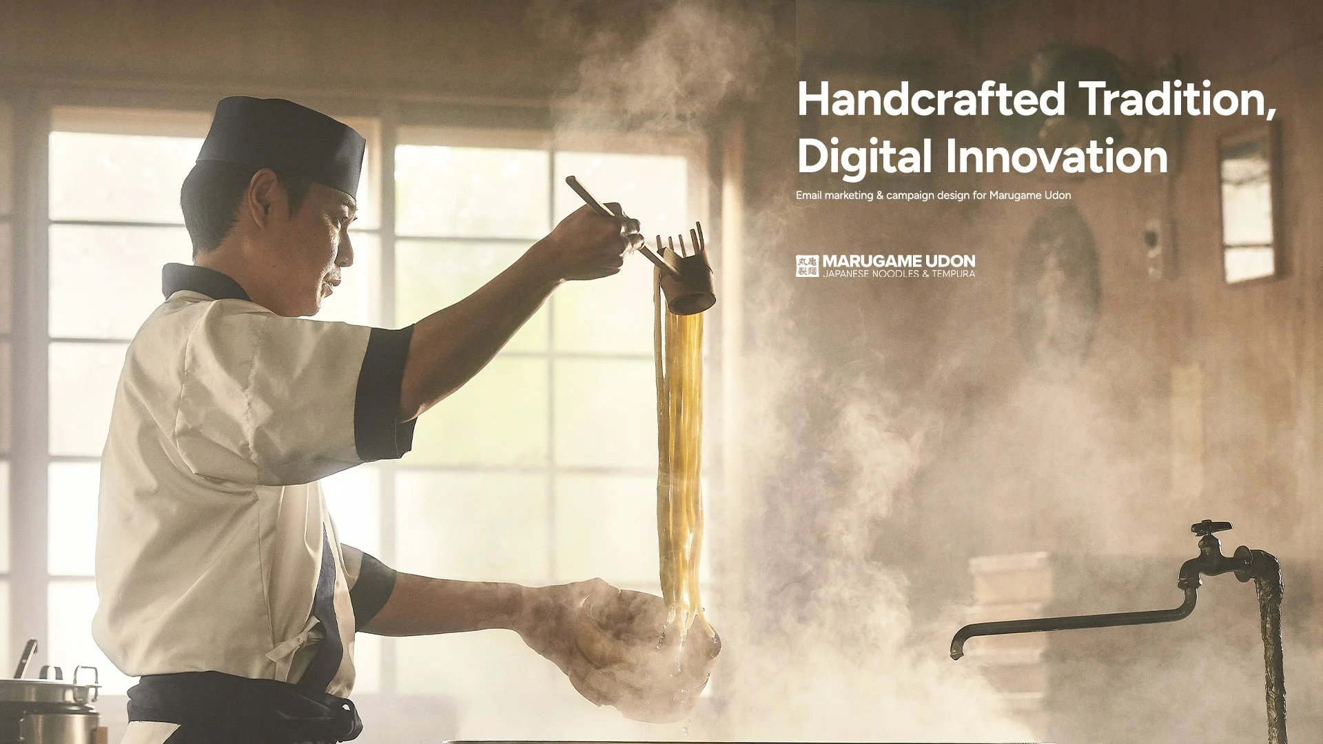
Marugame Udon – Brand Evolution & Campaign Design
Client Overview
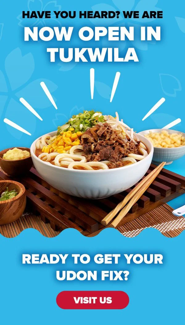
Marugame Udon is a fast-casual Japanese restaurant chain built around handcrafted udon made fresh daily. With a loyal customer base and a strong authentic identity, they needed marketing that honored their heritage while driving consistent foot traffic — premium and culturally grounded, never generic fast-casual.
My Role
Over two years I served as the design lead on Marugame's marketing campaigns, working alongside a client manager and development team. Year one focused on high-volume campaign execution within existing brand guidelines. In year two the client invited me to contribute design direction to a full brand evolution — helping shape the updated visual identity before returning to campaign execution within the new system.
Year One — Execution & Consistency
Working within Marugame's established brand guidelines I built and maintained a two-tiered campaign system:
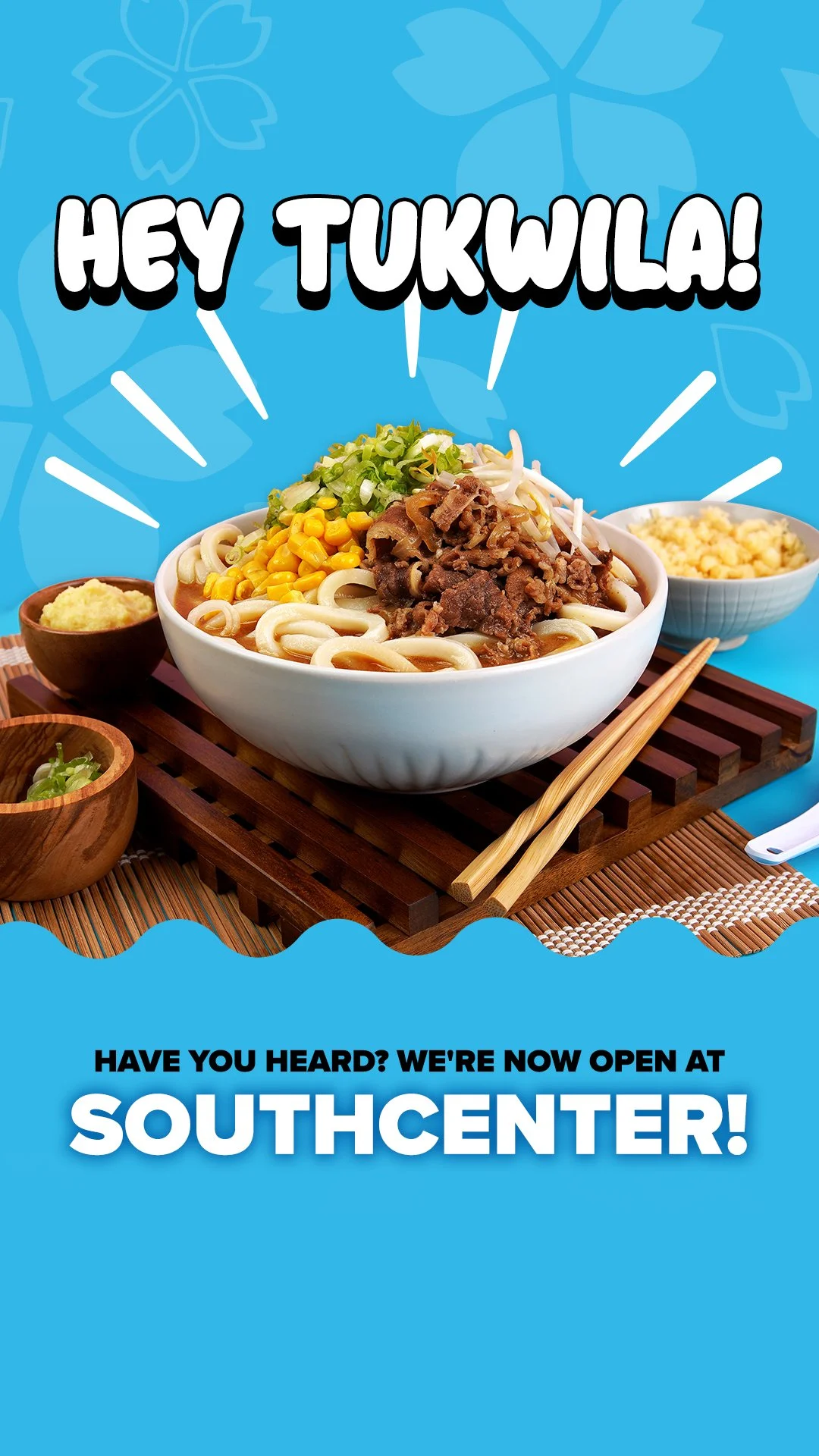
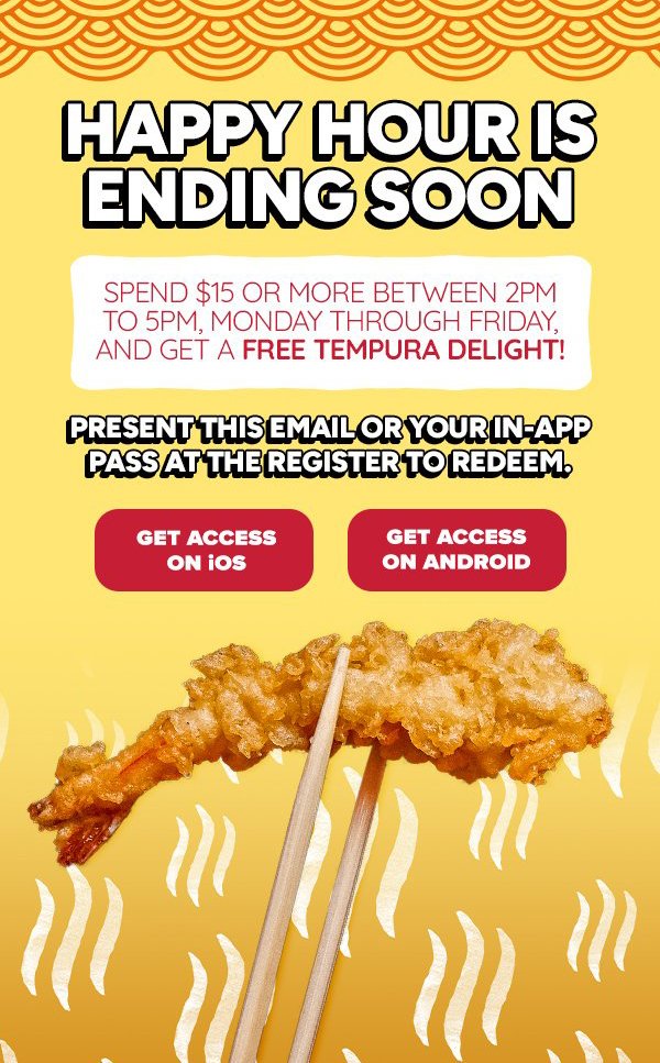
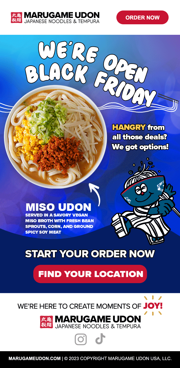
Monthly themed campaigns — seasonal ingredients and cultural moments for brand storytelling
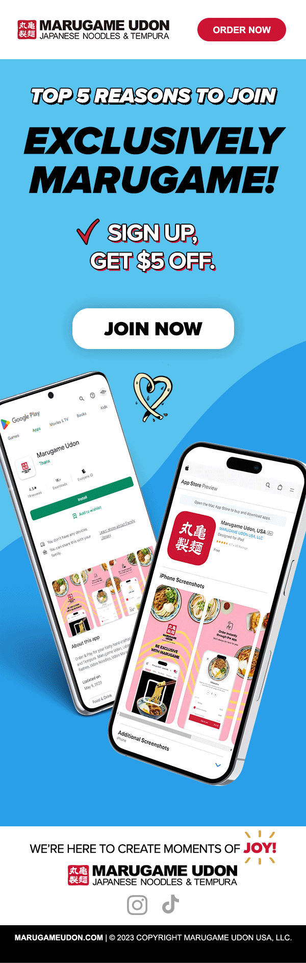
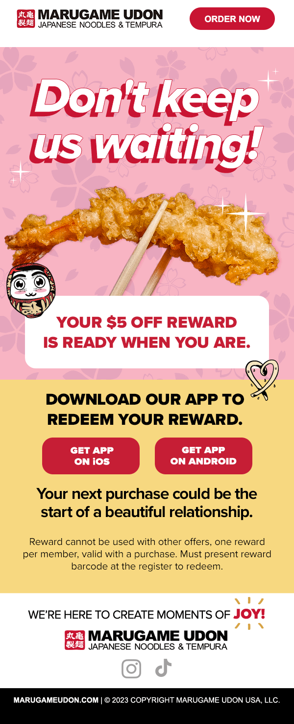
Weekly promotional emails — foot traffic drivers with clear CTAs and food-forward design
The priority was consistency across email, web, and promotional materials — ensuring every touchpoint felt cohesive whether a customer clicked from an email or walked in from the street.
Year Two — Brand Evolution
After a year of consistent execution the client wanted to explore a refreshed visual identity. I was brought in as the design voice — contributing to typography exploration, color refinement, and visual language development through the first few months of year two. The updated brand guidelines were built collaboratively with my design input.
All campaign work following the evolution was produced within the new system.
Visual Approach
Food-first design that makes people hungry. Every campaign prioritized:
High quality photography emphasizing texture, craft, and color
Clean layouts with generous negative space honoring the Japanese aesthetic
Bold typography with prominent CTAs
A balance between appetite-driven promotion and storytelling about authenticity
The goal was always to make marketing feel less like advertising and more like an invitation.
Campaign Work

Results
Following the brand evolution:
35% increase in brand recognition among customers Client-reported on campaign exit, year two.
"The most effective campaigns balanced immediate promotional value with storytelling about craft and authenticity. Audiences responded strongest when the work felt genuine — not like advertising."