BRAND IDENTITY • PACKAGING • CAMPAIGN • SOCIAL SYSTEMS

Prestige Skincare
Client
ATELIER LUMÉ
Role
Art Director
Scope
Brand · Packaging · Campaign · Social
Crafted for the skin that knows what it wants.
01 — Problem
Most prestige skincare brands choose between clinical authority and luxury aesthetics. ATELIER LUMÉ needed both.
The ultra-luxury skincare market splits between heritage houses that trade on legacy and a newer generation of efficacy brands that lead with science. Neither fully owns the space between them — rigorous formulation expressed with the aesthetic authority of a true luxury house.
3 Distinct competitive archetypes in the prestige skincare market
0 Independent brands owning both clinical credibility and editorial luxury
1 Identity system to unify brand, packaging, campaign, and social
The strategy
The prestige skincare market splits between heritage houses that trade on legacy and a newer generation of clinical brands that lead with science. Neither fully owns the space between them — the rigour of clinical efficacy expressed with the aesthetic authority of a luxury house.
That's the gap ATELIER LUMÉ was built to occupy.
The target customer is a woman aged 28–42. Urban, financially independent, research-driven. She reads the label. She cross-references clinical studies. She does not respond to trend. She is not buying a feeling — she is buying a result.
Positioning statement: For the woman who has stopped experimenting and started demanding. ATELIER LUMÉ is the prestige skincare house that earns its price through sourcing, process, and proof.
02 — Brand identity
Logo & mark

Color System
Encre
#1A1814
Structural anchor
Or
#C9A96E
Signature accent
Poudre
#E8E0D5
Surface warmth
Cendre
#6B6560
Editorial neutral
Blanc
#FAFAF8
Breathing room
Typography
Primary — Cormorant Garamond · Headlines, wordmark, campaign
The art of essential light.
Secondary — Montserrat · Body, labels, UI
Each formula begins with a single question: what does this skin truly need? Science answers. Craft delivers.
Accent — Spaced caps · Category labels, navigation
Serum · Moisturiser · Eye Treatment · Ritual Oil
Brand rationale
Encre + Or palette — dark without being cold. The warm gold accent prevents the brand from reading as stark or clinical, keeping it luxurious and considered.
Or hairline rule — a single deliberate accent element that appears across every touchpoint. Functions as punctuation, not decoration — a visual signature that ties packaging, campaign, and social into one coherent system.
Cormorant Garamond at open tracking — a high-contrast serif that communicates heritage and precision without referencing any specific cultural moment. Timeless rather than trendy
03 — Packaging
Product expression
The packaging system translates the identity into three-dimensional form — Premium glass, gold glitter finish, and minimal labelling that communicates the brand's price point before a word is read.
04 — Campaign
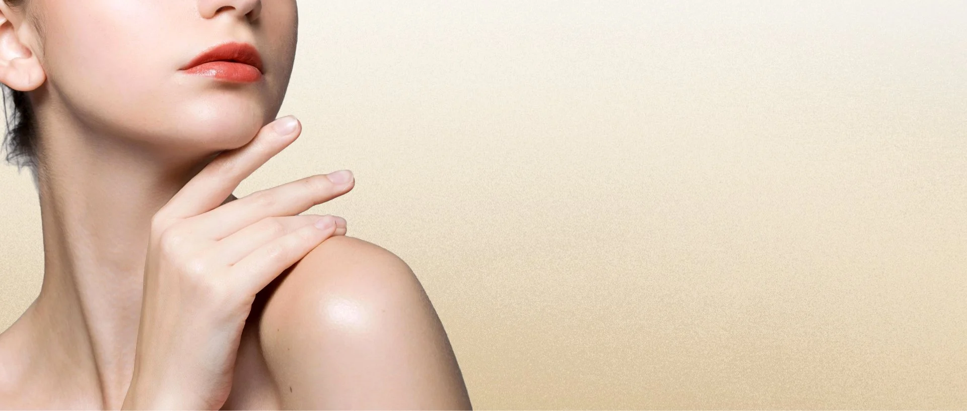
Editorial direction
The campaign is skin-forward and editorially sparse. Controlled light. Minimal composition. No lifestyle clichés. The typography sits in the frame the way a caption sits in a magazine — quiet, certain, unhurried.
05 — Social system
Content architecture
The social system was built to hold coherence at scale. Three post formats — product feature, ingredient story, and editorial quote — rotate across the feed on a grid logic that keeps the aesthetic consistent regardless of content type.
06 — Projected outcomes
System Design Goals
+40% Projected purchase intent among ingredient-conscious consumers via credible clinical positioning
1 system Single design language across brand, packaging, campaign, and social
4 categories Demonstrates AD range across identity, packaging, editorial campaign, and digital content