Brand identity + App design · Concept project

A strength studio identity built for the serious athlete
Client
COMMON
Role
Art Director
Scope
Brand · App · Print
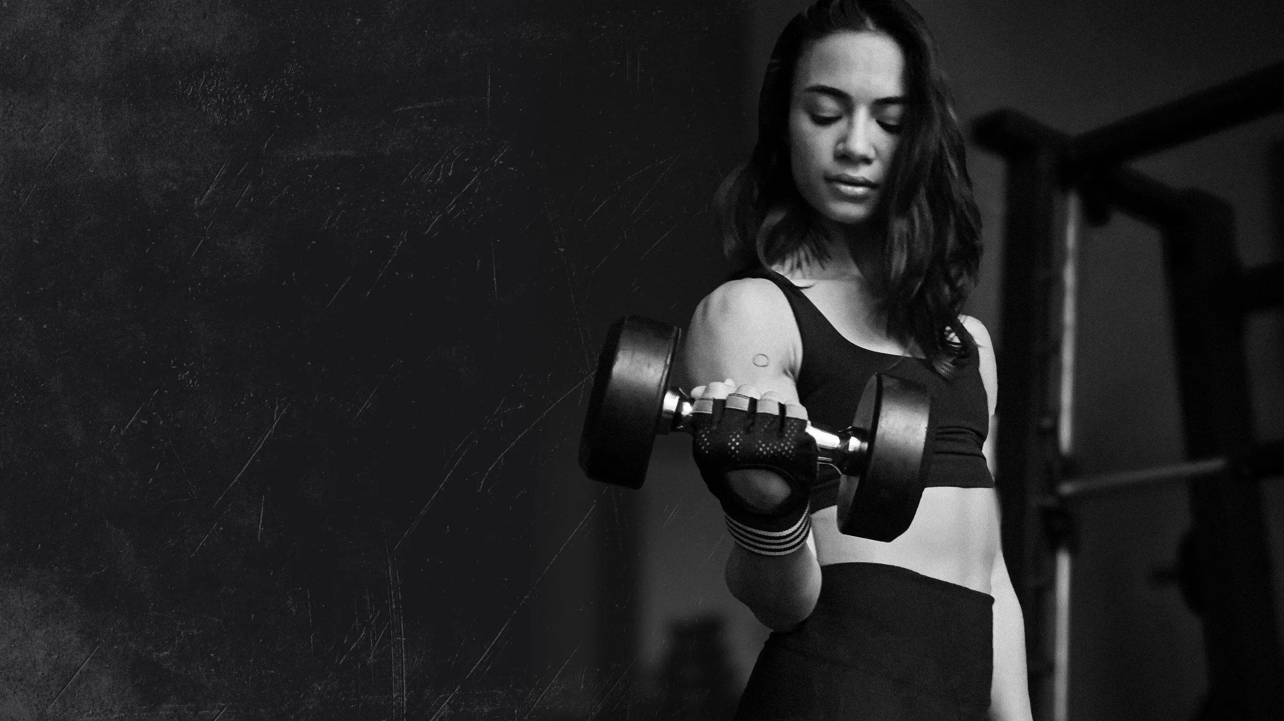
Strength through perseverance
01 — Problem
Most fitness brands choose between premium and approachable. COMMON needed both.
Independent strength studios in LA compete against polished chains that own the premium space and scrappy community gyms that own the belonging space. COMMON needed a brand that signaled elite seriousness without the exclusivity — a place that feels earned.
3 Competing brand archetypes in the LA strength market
0 Independent studios with a cohesive digital + physical identity
1 Design system to rule brand, app, and environment
02 — Brand identity
Logo & mark
Primary lockup Carbon on Stone
Icon Primary lockup Carbon on Stone
Reverse lockup White on Carbon
Icon Reverse lockup White on Carbon
Color system

Carbon
#1A1A1A
Structural anchor

Brushed Gray
#4A4A4A
Material tone

Cardinal
#C40532
Accent / edge
Stone
#F0EDE8
Surface / warmth
Light Stone
#FDFCFC
Breathing room
Typography
Montserrat Bold · Headings
Strength.
DM Sans Regular · Body copy
Built for the athlete who shows up every day.
Montserrat Bold · Labels / caps
Strength: Arms and Abs — 6:00 AM
Brand rationale
Carbon + Stone palette — industrial without being cold. The warm Stone offsets the heavy Carbon so the brand reads serious but not hostile.
4px red underline — a single deliberate accent. It functions as punctuation, not decoration — marking where attention should land.
Montserrat at 22% tracking — wide-set uppercase communicates authority and scale without needing a custom typeface.
03 — App design
Member experience
The app extends the brand system into a daily-use product — surfacing stats, enabling one-tap booking, and keeping members connected to coaches.
Login and onboarding
Member home
Scheduling
04 — Print & physical
Environmental executions
The brand extends beyond the studio floor. Every physical touchpoint, from apparel to accessories, carries the same visual language as the space itself.
05 — Projected outcomes
System Design Goals
+30%
Projected class booking rate via streamlined app UX
1 system
Single design language across digital, app, and print
3 roles
Demonstrates AD, brand systems, and product design skills
COMMON started as a personal brief — a brand I wanted to exist as someone who trains. The real challenge was making something that felt inevitable: a design system so internally consistent that every surface, screen, and touchpoint could only belong to one place.