Art Direction · UX Strategy · Visual Identity · Photography Direction · Design Systems
ALCO Designs Website – Art Direction
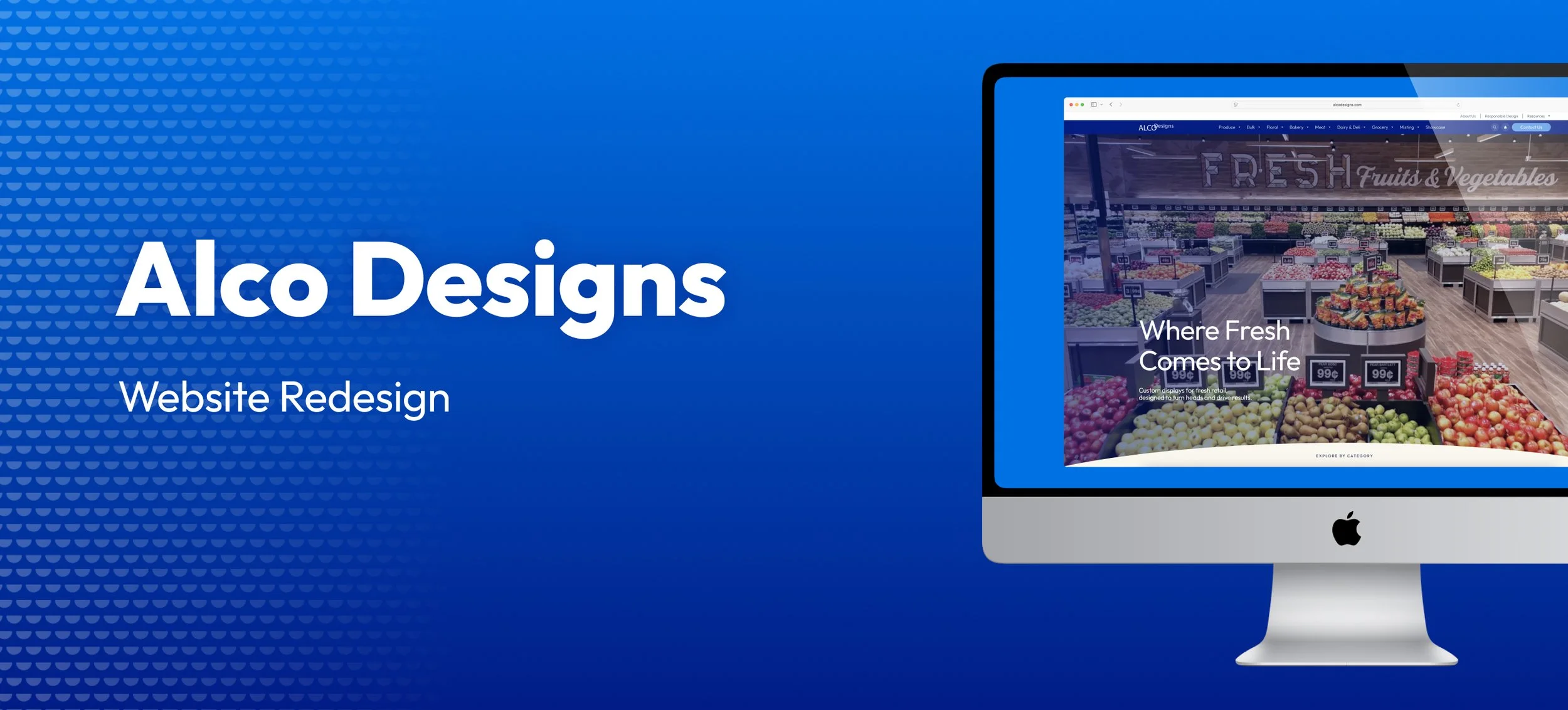
The Challenge
ALCO Designs' website hadn't been touched since the 2010s. Built on Shopify and functioning more as a glorified product catalog than a modern business website, it suffered from poor navigation, no mobile optimization, and thousands of products dumped into a single unorganized space with no hierarchy or logic. There was no clear brand identity, no calls to action, and no system to help B2B customers find what they needed.
I joined the team without a detailed brief. The problem was clear — the solution wasn't yet
My Role
Working directly with my managers and directing external development agency Blacksmith, I defined the creative vision from the ground up — establishing the visual identity, information architecture, and design system before a single page was built. This wasn't execution of someone else's brief. It was Art Direction from zero.
The Result
The ALCO Designs website needed more than a visual refresh — it needed a product experience that could convert B2B buyers who arrive knowing what they want and leave without requesting a quote. The product detail page was the highest-friction point in that journey.
Each PDP was designed to carry the full weight of the sales conversation: a multi-image gallery showing the product in context, a clear product description written for buyers not browsers, material and SKU information surfaced above the fold, and an automatically generated "You May Also Like" row that keeps buyers moving through the catalogue rather than exiting.
The result is a product page system that functions as a silent salesperson — organized, credible, and built to move a B2B buyer from consideration to quote request in a single visit.
The Solution: A System, Not Just a Redesign
The core insight was that ALCO's product complexity required a navigational system, not just a visual refresh. With thousands of products across multiple departments, customers needed to be able to orient themselves instantly and move through the site with confidence.
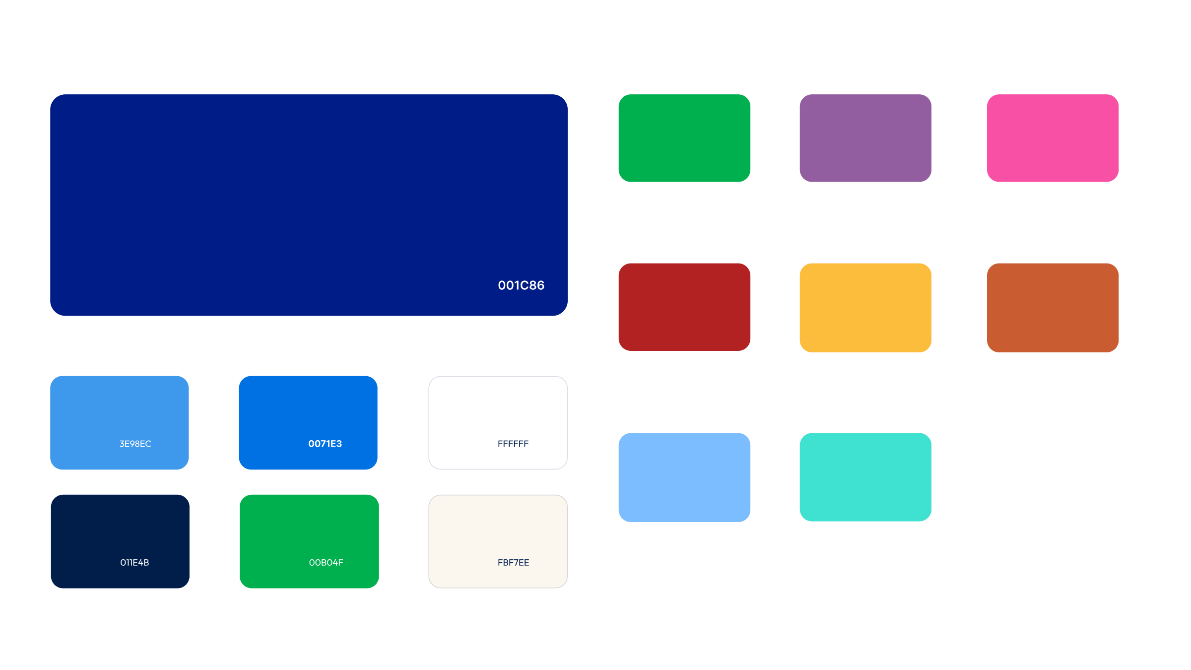
I developed a color-coding system that mapped tertiary brand colors directly to product departments — green for produce, red for meat, yellow for dairy — creating an intuitive visual language that anchors customers as they navigate. Every color choice has a logic behind it.
Products were reorganized from a single flat collection into a structured taxonomy: department-level categories with subcategories by product type. What was once thousands of products in one undifferentiated list became a navigable, logical system.
Brand Evolution
My approach centered on creating a flexible, modern visual system that could grow with the company. I modernized ALCO's existing blue, introduced a strategic green to expand the palette, and developed tertiary colors mapped to product categories — creating an intuitive color-coding system that improves navigation and strengthens brand recognition.
Every design decision was made to position ALCO as innovative, accessible, and professional.
New Colors
39 Custom Icons
Designed a comprehensive icon system to create visual consistency across the site. Each icon balances clarity with brand personality, ensuring intuitive navigation and reinforcing ALCO's modern identity.
Project Scope
The redesign covered nine page templates built for scale: Homepage · About · Contact · Product Pages · Product Category Pages · Resources · Careers · Latest News & Blog · Case Studies
Outcome
Launched September 2025, the redesigned ALCO Designs website replaced a decade-old catalog with a modern, navigable digital experience — built on a design system with the logic and flexibility to grow with the business.
Developed in partnership with Blacksmith.