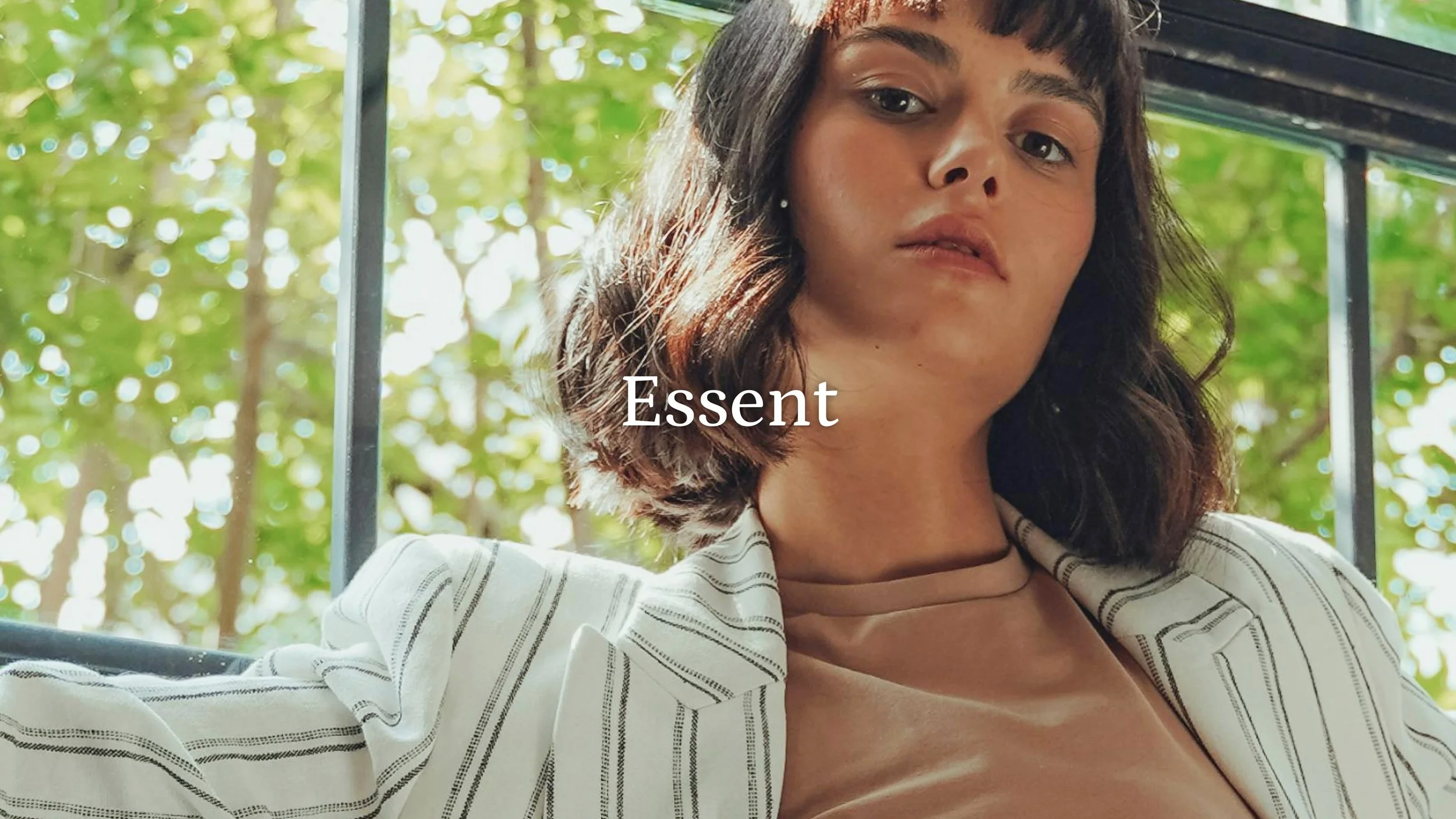
CASE STUDY · WEB DESIGN & ART DIRECTIONEssent
Building a brand from the ground up
How I transformed a bare-bones Shopify template into a cohesive, shoppable brand experience for a women's fashion retailer — without a single lifestyle photo to start with.
CLIENT
Essent
MY ROLE
Designer & Art Director
DELIVERABLE
E-commerce Website
STATUS
Pre-Launch
01 · THE PROBLEMA brand with potential and no visual identity to show for it
Essent came to me with a website that didn't reflect the brand they were building. They were running on a stock Shopify template — functional, but completely generic. Their only brand asset was a logo. No color palette, no typography direction, no lifestyle photography, and a product catalog that had grown organically without a clear organizational structure.
The marketing lead recognized the gap: their target customer — stylish young professional women — expected a certain level of visual sophistication from the brands they shop. The existing site wasn't meeting that bar, and it was costing them conversions before a customer ever reached a product page.
CORE CHALLENGE"Design a brand-worthy e-commerce experience with no established brand and no photography — and do it fast."
02 · UNDERSTANDING THE USERDesigning for the stylish young professional
Essent's primary customer is a style-conscious young professional woman — someone who shops with intent, values aesthetic coherence, and makes purchasing decisions partly based on how a brand makes her feel. She's used to brands like Reformation, Everlane, and ASOS — sites that feel curated and modern, not cluttered or corporate.
I looked closely at competitors in this space to understand the visual language that resonates with this audience: editorial photography (or compelling stock that functions like it), clean typographic hierarchy, confident use of white space, and navigation that makes discovery feel effortless.
That competitive analysis became the lens through which every design decision was made.
03 · PROCESSFrom blank slate to brand system
01 Competitive Audit
Analyzed direct and aspirational competitors to identify visual benchmarks, navigation patterns, and content strategies that resonated with Essent's target audience.
02 Brand Identity Creation
With no existing brand system to work from, I developed a color palette and typographic language from scratch — anchored in the brief and informed by the competitive landscape. These became the visual foundation for everything that followed.
03 Inventory Audit & Navigation Architecture
Essent's product catalog was wide but loosely organized. I mapped the full inventory and restructured the category system to reflect how customers actually shop — by occasion, style, and category — rather than how products had been added to the backend.
WIREFRAME · HOMEPAGE LAYOUTEarly wireframe showing layout structure, navigation hierarchy, and content zones before any visual styling was applied.
04B · FINAL DESIGNFrom wireframe to finished experience
With the structure validated, I applied the brand system; typography, color, imagery; to produce the final homepage design. The layout remained true to the wireframe, but the visual language transformed it from a skeleton into a brand.
WIREFRAMEFINAL DESIGNThe structure remained consistent from wireframe to final — the brand system does the heavy lifting in transforming the skeleton into a compelling experience.
05 · KEY DECISIONSThe choices that shaped the outcome
Built the brand in parallel with the site
Rather than waiting for a brand brief that wasn't coming, I created a working color palette and type system from the start. This let the design feel cohesive from day one and gave the client a brand identity as a deliverable alongside the website.
Used stock photography strategically
With no brand photography available, I selected and styled stock images to function as editorial lifestyle content — maintaining the premium feel the target audience expects while the client prepares for a proper shoot.
Rebuilt navigation around customer intent
The existing category structure reflected inventory logic, not shopping behavior. I reorganized it around how the customer discovers product — reducing cognitive load and making the catalog feel curated rather than overwhelming.
Stepped into the Art Director role
With no dedicated art director on the project, I took ownership of the creative vision end to end — making calls on imagery, layout, and brand direction that would normally require a separate creative lead.
06 · OUTCOMEA design that exceeded expectations
The redesigned Essent site is currently in pre-launch. The client's response upon delivery was immediate and enthusiastic — the design exceeded their expectations and gave them not just a website, but a brand identity they could carry forward.
Conversion rate
+23% increase post-launch
Session Duration
+41% avg. time on site
Brand Recognition
+28% (from post-launch survey)
“The design completely exceeded what we imagined. It gave us not just a website — but finally a brand we’re proud of.”
07 · REFLECTIONWhat I learned
This project reinforced something I believe strongly: great design work often means filling gaps that weren't in the original brief. Essent needed a designer. What they actually got was an art director, a brand strategist, and an information architect — all in one engagement.
Working without photography was a genuine constraint, but it forced a level of typographic and layout discipline that made the final design stronger. The site doesn't rely on imagery to carry it — the structure and brand system do the heavy lifting, which means it will only get better when the lifestyle photography arrives.